
User:Uwappa

Today's featured picture
_underside_2_Komodo_I.jpg)
|
Acraea terpsicore, commonly known as the tawny coster, is a species of butterfly in the Nymphalidae family, the brush-footed butterflies. It is found across eastern Asia from India and Sri Lanka to Singapore, Indonesia and the Maldives and, more recently, Australia. It is small, with a size of 53–64 millimetres (2.1–2.5 in), has leathery wings and is common in grassland and scrub habitats. Acraea terpsicore has a weak fluttery flight and is avoided by most insect predators. This A. terpsicore individual was photographed in Komodo National Park, Indonesia. Photograph credit: Charles J. Sharp
Recently featured:
|
About[edit]

| Uwappa creates a web to save Banjora from the mundurras in an Ngarrindjeri dreaming story. |
| This user has experienced guidance from Yurluggur. |
| This user is not yet dead. Please check back later... |
| This user loves the Kurangk. |
| This user has enjoyed the hospitality of the Ngarrindjeri. |
| wgu-0 | This user has learnt a few words of Wirangu. |
| This user felt at home in Nantawarrina, Adnyamathanha land. |
| This user thanks the Yolŋu for sharing basic Aboriginal culture. |
| This user loves dragon dreaming. |
Toolbox[edit]

Climate |
|
|---|---|
| The core of the human eye can read
|
|

Edit |
- |

Graphs |
|

Wikipedia |
|
Graphs[edit]
I love it how Aboriginal paintings depict a whole story.
Good graphs can also tell a story, as Edward Tufte describes in his books on data visualization.
Global warming[edit]
-
 Daily Sea Surface Temperatures 60S-60N 1979-2023

This Copernicus graph is a jewel. It is a graph that tells a whole story in an instant.
The blue, white, red lines are like waves of an ocean. The colours seem to show increasing temperature, yet actually show time, decades of data. Time and temperature coincide.
2023 jumps out of the waves, is out of bandwidth. Oceans are warming.
Climate change graphs[edit]
-
 A Péguy climograph shows average temperature and precipitation of a climate per month.
 -
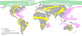
 Change of climate and its impact, with red for impossible agriculture.
 -
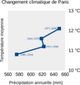 120 years of climate change in Paris.
 -
 Climate change in Paris 1881-2000.
 -
 Impact


Climate tipping point +1.5 °C[edit]
-
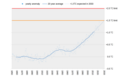 The 20 year average is expected to cross +1.5 °C in 2033.
 -
 In 2000 the tipping point was expected in 2045. In 2023 the expectation was 2033.

Polls[edit]
This chart tells the story of an election or poll. What are the changes since the previous election?
- new party.
- party that gained seats.
- party maintained seats, did not win, did not lose.
- Party lost seats. The top of is the result in the previous election.
- party lost all seats.
:( Graph module down[edit]
| Graphs are unavailable due to technical issues. There is more info on Phabricator and on MediaWiki.org. |